Wilderness Plantation Kitchen Remodel
- Robin Johnson

- Feb 10, 2023
- 2 min read
Today's blogpost features a kitchen renovation right down the street! My neighbor hired me to design a new and improved kitchen for her keeping the same basic layout. She was ready to update her cabinets, countertops and really needed more storage.
It's true you never know what you're going to find during demo and this project was proof of that. Often times though, it's a good thing because something important needs to be addressed. In this case, after removing the cabinets which were sitting on plywood, there was evidence of water damage. After pulling up the plywood, the joists that support the center of the home were so rotted you could poke your finger right through them! They were replaced and the project resumed. Whew. Here's a few pictures of the scene below.
The new design for the kitchen includes many improvements in layout, function and aesthetics. Specifically we implemented the following into the new plan:

New cabinets run to the 9' ceiling
Eliminated island cooktop
Eliminated double wall ovens
New range and microwave
New farm sink
Spice pull out cabinets on either side of the microwave
Tray divider pull outs on either side of the range
Lots of drawers for storage
Extra wide pots and pans drawer
Built in coffee and toaster cabinet with electrical
Built in broom closet with electrical
Built in refrigerator
Single height eat at bar
New light fixtures
Shiplap on rear and side of bar
Shiplap on backsplash
Shiplap on art wall
New hardware
New countertops
That's a big list which means this kitchen is not only going to look amazing but function amazing too! I'm not usually a fan of putting microwaves over the range but in this case we were limited on space and the island is going to look more like a piece of furniture when we are done with it... too pretty for a microwave drawer!

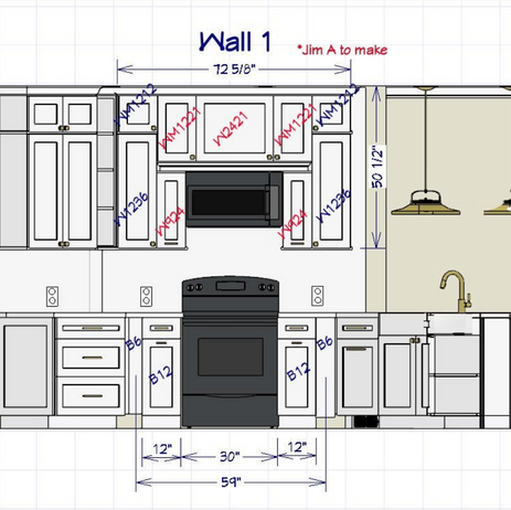
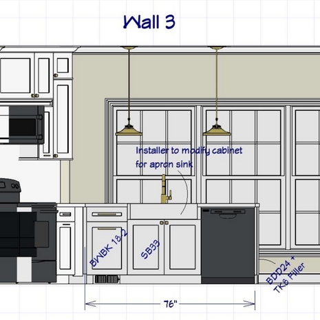
Here are the wall elevations detailing the design plans. For reference, this remodel project cost in the range of $40-$45k. We were able to save money using factory cabinets for about 85% of the project. The other 15% we had to have custom made and painted to match because the stock line didn't offer the sizes we needed. (Cabinets in red below.) Note the little bookcase we had made to fit a tight spot that will be great for storing cookbooks, art, etc.
Wall 3 shows the new apron front sink with a double trash can to the left. Wall 4 looks so much better as we were able to run all of the cabinets 27" deep to surround the standard depth refrigerator. Note the broom closet on the bottom with outlets for charging the Dyson!
Lastly, Wall 7 & 8 show the far side of the kitchen and the rear of the eat at bar. Wall 7 includes a built in coffee bar and hidden toaster oven on the far left. To the right is where the homeowners favorite kitchen art will hang between slim upper cabinets.
Hope you enjoyed reading about this project! You can follow me on Facebook and Instagram for more updates and to see other projects @robinjohnsoninteriors. Have a great weekend!


Comments